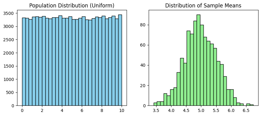
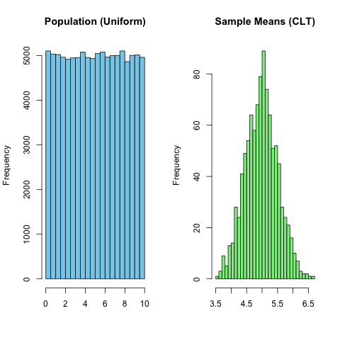
Suppose \(X_1\), \(X_2\) ,…, \(X_n\) are independent and identically distributed random variables (i.i.d. r.v.) with mean \(\mu\) and variance \(\sigma^2\) . Then as \(n\) grows, the standardized
\[
Z_n = \frac{\bar{X}_n-\mu}{\sigma/\sqrt{n}}
\]
converges to a standard normal distribution \(N(0,1)\).
Chaos + Repetition = Order.
The following codes were generated by ChatGPT with NO cross-validation performed yet
Code
import numpy as npimport matplotlib.pyplot as plt# Step 1: Create a population that is NOT normal (e.g., uniform between 0 and 10)population =np.random.uniform(0, 10, 100000)# Step 2: Take many samples and compute their meanssample_means = []for i inrange(1000):# number of samples sample =np.random.choice(population, size=30) # sample size = 30sample_means.append(np.mean(sample))# Step 3: Plot the population vs. the sampling distributionplt.figure(figsize=(10,4))# Plot the original populationplt.subplot(1,2,1)plt.hist(population, bins=30, color="skyblue", edgecolor="black")plt.title("Population Distribution (Uniform)")# Plot the distribution of sample meansplt.subplot(1,2,2)plt.hist(sample_means, bins=30, color="lightgreen", edgecolor="black")plt.title("Distribution of Sample Means")plt.show()
Matplotlib is building the font cache; this may take a moment.
Similarly, the simulation can be done in r
Code
%load_ext rpy2.ipython
Code
%%R# R cell# Step 1: Create a population that is NOT normal (uniform from 0 to 10)population <-runif(100000, min =0, max =10)# Step 2: Take many samples and compute their meanssample_means <-c()for (i in1:1000) { # number of samples sample <-sample(population, size =30, replace =TRUE) # sample size = 30 sample_means <-c(sample_means, mean(sample))}# Step 3: Plot the population vs. the sampling distributionpar(mfrow =c(1, 2)) # two plots side by side# Plot the original populationhist(population, breaks =30, col ="skyblue", main ="Population (Uniform)", xlab ="")# Plot the distribution of sample meanshist(sample_means, breaks =30, col ="lightgreen", main ="Sample Means (CLT)", xlab ="")
Confidence Interval
The 95% confidence interval for a normal population mean is \[
[\bar{X} - 1.96 \frac{S}{\sqrt{n}}, \bar{X} + 1.96 \frac{S}{\sqrt{n}}]
\]
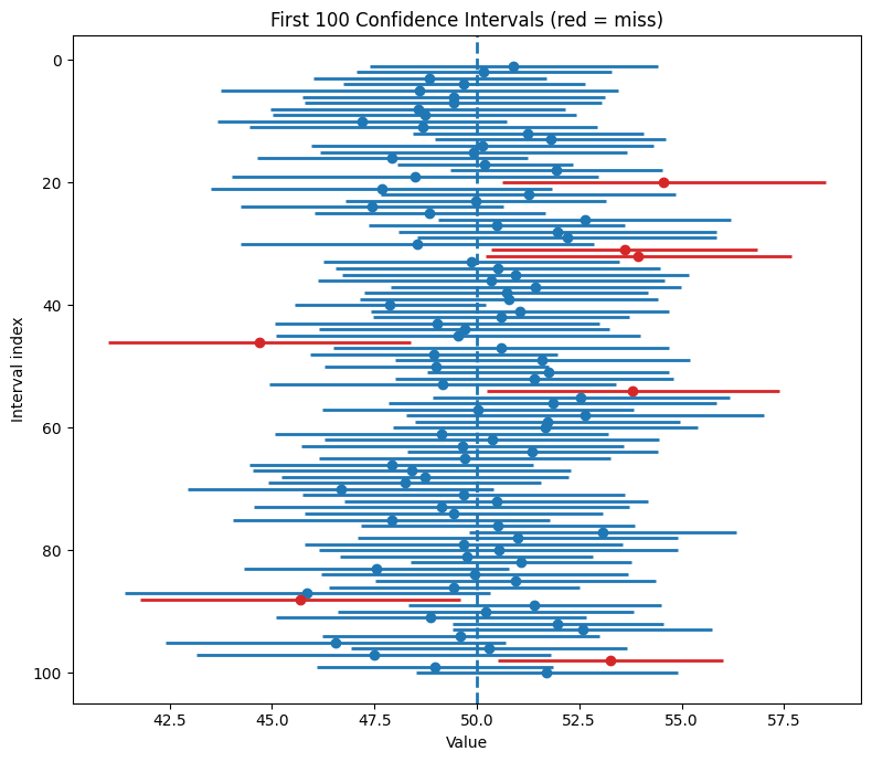
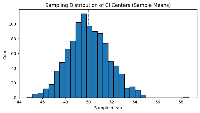
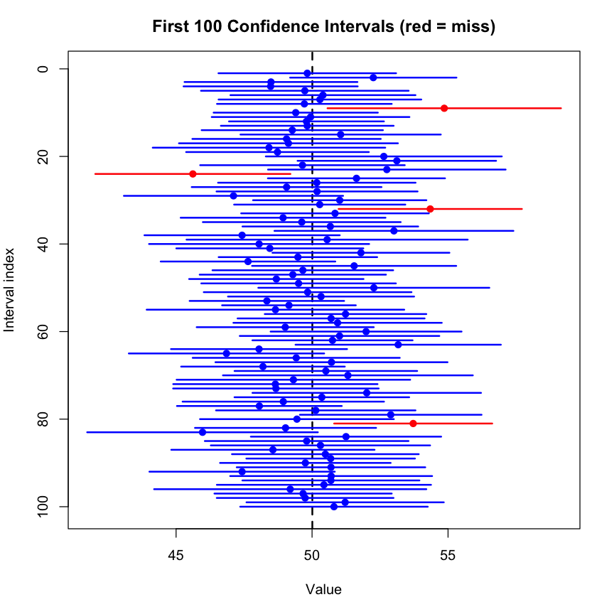
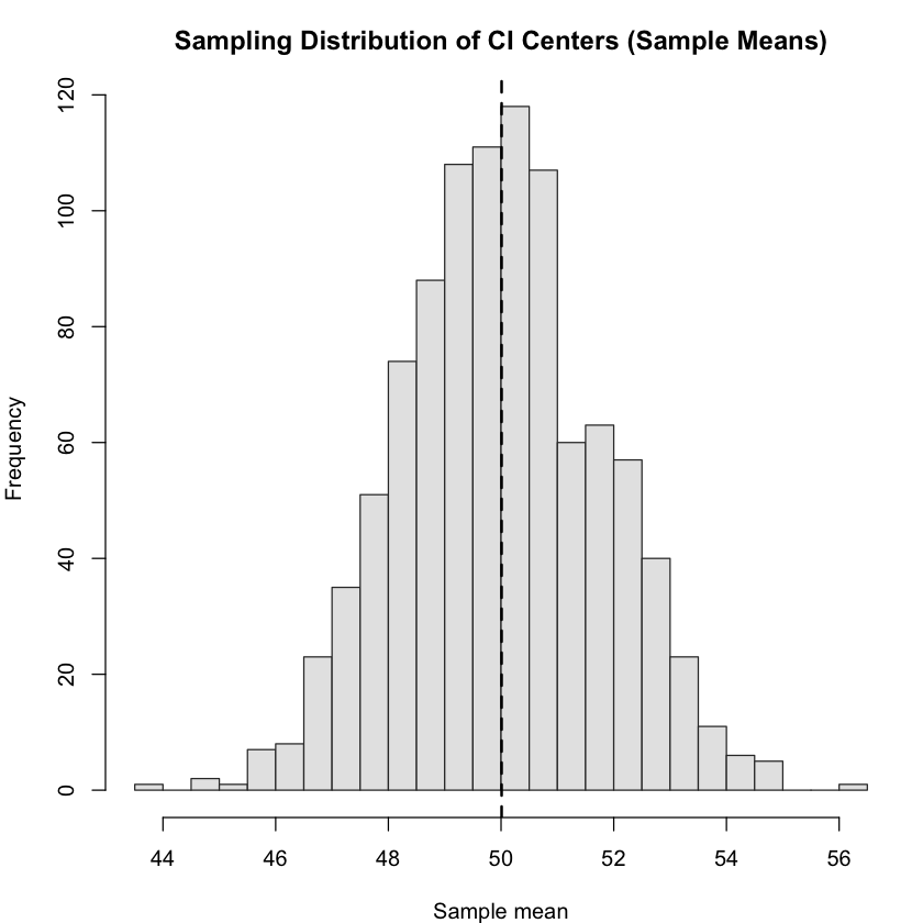
Write a simulation program to demonstrate how confidence intervals work by checking how often they capture the true parameter.
Code
import numpy as npimport matplotlib.pyplot as pltnp.random.seed(123)# --- Step 1: Population (normal for simplicity) ---population =np.random.normal(loc=50, scale=10, size=100_000)true_mean =np.mean(population)# --- Step 2: Simulation settings ---num_experiments =1000sample_size =30z =1.96# 95% z-critical (simple intro version)centers = [] # store CI centers (sample means)lowers = [] # store CI lower boundsuppers = [] # store CI upper boundscovers = [] # store True/False: CI contains true mean?# --- Step 3: Simulate many CIs ---for i inrange(num_experiments): sample =np.random.choice(population, size=sample_size, replace=False) xbar =np.mean(sample) s =np.std(sample, ddof=1) se = s /np.sqrt(sample_size) lower = xbar - z * se upper = xbar + z * secenters.append(xbar)lowers.append(lower)uppers.append(upper)covers.append(lower <= true_mean <= upper)coverage =np.mean(covers)print(f"Proportion of 95% CIs containing the true mean: {coverage:.3f}")# --- Step 4: Visualization ---# 4a. Ladder plot for the first 100 intervalsk =100# how many intervals to drawidx =np.arange(1, k +1)plt.figure(figsize=(8, 7))# draw each interval; color red if it misses the true meanfor i inrange(k): color ="tab:blue"if covers[i] else"tab:red"plt.hlines(idx[i], xmin=lowers[i], xmax=uppers[i], colors=color, linewidth=2)# mark the centerplt.plot(centers[i], idx[i], 'o', color=color)# vertical line at the true meanplt.axvline(true_mean, linestyle="--", linewidth=2)plt.title("First 100 Confidence Intervals (red = miss)")plt.xlabel("Value")plt.ylabel("Interval index")plt.gca().invert_yaxis() # top to bottomplt.tight_layout()plt.show()# 4b. Histogram of CI centers (sample means)plt.figure(figsize=(7, 4))plt.hist(centers, bins=30, edgecolor="black")plt.axvline(true_mean, linestyle="--", linewidth=2)plt.title("Sampling Distribution of CI Centers (Sample Means)")plt.xlabel("Sample mean")plt.ylabel("Count")plt.tight_layout()plt.show()# --- Optional (more correct small-sample version): use t critical instead of z ---# from scipy.stats import t# tcrit = t.ppf(0.975, df=sample_size-1)
Proportion of 95% CIs containing the true mean: 0.933
Code
set.seed(123)# --- Step 1: Population (normal for simplicity) ---population <-rnorm(100000, mean =50, sd =10)true_mean <-mean(population)# --- Step 2: Simulation settings ---num_experiments <-1000sample_size <-30z <-1.96# 95% z-critical (simple intro version)centers <-numeric(num_experiments)lowers <-numeric(num_experiments)uppers <-numeric(num_experiments)covers <-logical(num_experiments)# --- Step 3: Simulate many CIs ---for (i in1:num_experiments) { samp <-sample(population, size = sample_size, replace =FALSE) xbar <-mean(samp) s <-sd(samp) se <- s /sqrt(sample_size) lower <- xbar - z * se upper <- xbar + z * se centers[i] <- xbar lowers[i] <- lower uppers[i] <- upper covers[i] <- (lower <= true_mean && true_mean <= upper)}coverage <-mean(covers)cat("Proportion of 95% CIs containing the true mean:", round(coverage, 3), "\n")# --- Step 4: Visualization ---# 4a. Ladder plot for the first 100 intervalsk <-100idx <-1:kop <-par(no.readonly =TRUE)par(mar =c(4, 4, 3, 1))plot(NA, xlim =range(c(lowers[1:k], uppers[1:k], true_mean)),ylim =c(k +1, 0), xlab ="Value", ylab ="Interval index",main ="First 100 Confidence Intervals (red = miss)")abline(v = true_mean, lty =2, lwd =2)for (i in1:k) { col <-if (covers[i]) "blue"else"red"segments(lowers[i], i, uppers[i], i, col = col, lwd =2)points(centers[i], i, pch =19, col = col)}# 4b. Histogram of CI centers (sample means)par(mfrow =c(1, 1))hist(centers, breaks =30, col ="gray90", border ="gray20",main ="Sampling Distribution of CI Centers (Sample Means)",xlab ="Sample mean")abline(v = true_mean, lty =2, lwd =2)par(op)# --- Optional (more correct small-sample version): use t critical instead of z ---# tcrit <- qt(0.975, df = sample_size - 1)
Proportion of 95% CIs containing the true mean: 0.957