In the last lecture, we introduced the Sequential Probability Ratio Test (SPRT). Let’s move to more Control Charts.
Shewhart Control Chart
A Shewhart control chart (also called an X-bar chart or simply a control chart) is one of the foundational tools in statistical quality control, developed by Walter A. Shewhart in the 1920s at Bell Labs. It is used to monitor whether a process is stable (only subject to common cause variation) or has gone “out of control” (due to special cause variation).
Key Ideas
Center Line (CL): Represents the expected process average or desired value (e.g., the historical mean).
Control Limits (UCL and LCL): Typically set at \(\pm 3\frac{\sigma}{\sqrt{n}}\) from the center line. Upper Control Limit (UCL) = mean + \(3\frac{\sigma}{\sqrt{n}}\) , Lower Control Limit (LCL) = mean - \(3\sigma\) .
In practice there are two common approaches to estimate \(\sigma\) : the R method and the S method.
R(Range) method: Estimates \(\sigma\) using the average subgroup range, adjusted by an unbiased correction factor, \(\hat{\sigma}=a_n\bar{R}\).
S(Standard deviation): Estimates \(\sigma\) using the average subgroup standard deviations, adjusted by an unbiased correction factor, \(\hat{\sigma}=b_n\bar{S}\) .
Data Plotting: You don’t plot every individual observation. Instead, sample statistics (often the mean of a subgroup) are plotted over time.
Interpretation:
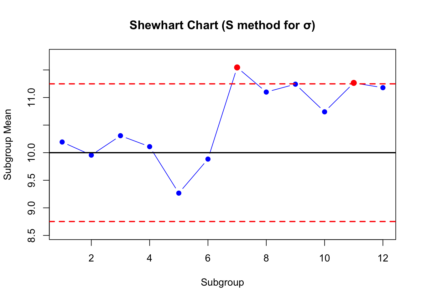
If all points lie within control limits and show no non-random patterns, the process is considered in control.
Points outside the limits, or unusual patterns (like runs, trends, cycles), suggest special causes that require investigation, or an out-of-control condition.
set.seed(123)# Parametersn_total <-60# total observationsn_s <-5# subgroup sizek <- n_total / n_s # number of subgroupssigma_shift <-1# mean shift after subgroup 6# Generate data (shift after halfway from 10 to 11)x <-c(rnorm(30, 10, sd=1),rnorm(30, 10+1, sd=1))# Split into subgroupssubgroups <-matrix(x, ncol=n_s, byrow=TRUE)means <-rowMeans(subgroups) # Subgroup meanss_i <-apply(subgroups, 1, sd) # Subgroup means and SDs# --- S-method estimate of sigma with c4 correction ---# c4(n) = sqrt(2/(n-1)) * Gamma(n/2) / Gamma((n-1)/2)c4 <-sqrt(2/(n_s -1)) *gamma(n_s/2) /gamma((n_s -1)/2)Sbar <-mean(s_i)sigma_hat <- Sbar / c4# --- X-bar chart limits using estimated sigma ---CL <-10UCL <- CL +3* sigma_hat /sqrt(n_s)LCL <- CL -3* sigma_hat /sqrt(n_s)# Plot X-bar Shewhart Chartplot(means, type="b", pch=19, col="blue",ylim=c(min(means, LCL)-0.2, max(means, UCL)+0.2),main="Shewhart Chart (S method for σ)",xlab="Subgroup", ylab="Subgroup Mean")abline(h=CL, col="black", lwd=2)abline(h=UCL, col="red", lwd=2, lty=2)abline(h=LCL, col="red", lwd=2, lty=2)# Highlight out-of-control pointsout_of_control <-which(means > UCL | means < LCL)points(out_of_control, means[out_of_control], col="red", pch=19, cex=1.2)
Activity: Exploring Shewhart Control Chart Sensitivity with AI
Ask your AI assistant to generate a dataset of 20 subgroups, each with 5 measurement, from a normal distribution with mean = 10 and standard deviation = 1.
Plot the Shewhart control chart with appropriate control limits (±3σ).
Next, shift the process mean after sample 10 to different values (e.g., 10.1, 10.3, 10.5, 11, 11.5, 12) and re-plot the control chart.
Compare how quickly the control chart detects these shifts.
Does the chart detect small shifts (like +0.1σ) or only larger shifts (like +3σ)?
How many samples does it take before the shift is visible as “out of control”?
Beyond Shewhart: CUSUM
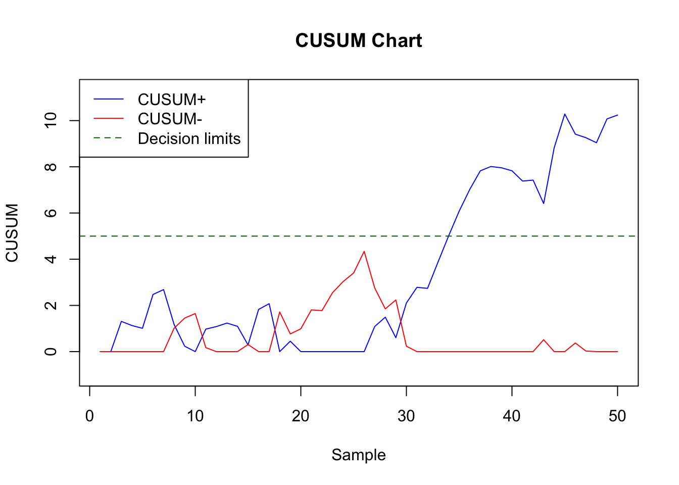
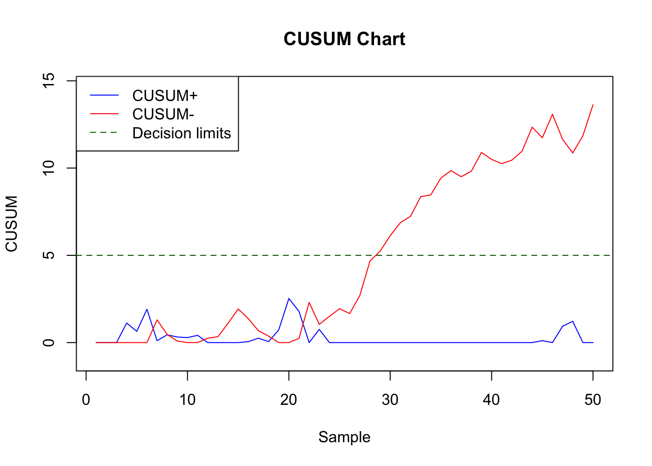
Shewhart charts are good at catching large, sudden shifts, but they are slow at detecting small, persistent changes. CUSUM (Cumulative Sum control chart) accumulates small deviations of each sample from the target mean. This makes it very sensitive to small, sustained shifts in the process mean (like 0.3σ or 0.5σ).
Instead of looking only at the most recent sample, like Shewhart chart, CUSUM accumulates the information over time.
Suppose the target mean is \(\mu\) , and each sample \(x_t\) we track two cumulative sums:
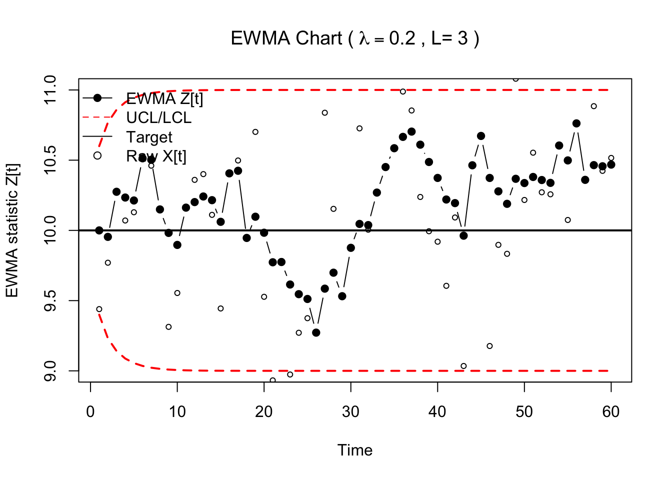
EWMA (Exponentially Weighted Moving Average) control charts can detect small, persistent mean shifts faster than Shewhart chart, with a simple, memory based smoother. EWMA charts plot the following statistics:
\[
Z_0 = \mu \text{Target Value}
\]
\[
Z_t = \lambda x_t + (1-\lambda) Z_{t-1}
\]
where \(\lambda \in (0,1)\) is a smoothing or weight parameter. Small \(\lambda\) (typical choices 0.05 - 0.3) provides more smoothing and are better for tiny shifts.
Again, we need to define the control limits. In EWMA, the control limits have a time-varying “start-up” form:
Here “?” is a function of \(L, \lambda\) and \(t\) . “L” is another parameter. Increase L will reduce false alarms, decrease L will speed up the detection.
Code
# This piece of code is generated by ChatGPT for illustration onlyset.seed(123)# --- Parameters ---n <-60mu0 <-10# target meansigma <-1# known in-control sd (see note below if unknown)t_shift <-30# time of mean shiftdelta <-0.3# size of shift in absolute unitslambda <-0.2# EWMA smoothingL <-3# decision multiplier# --- Simulate data with a mean shift ---x <-c(rnorm(t_shift, mean = mu0, sd = sigma),rnorm(n - t_shift, mean = mu0 + delta, sd = sigma))# --- EWMA recursion ---z <-numeric(n)z[1] <- mu0for (t in2:n) { z[t] <- lambda * x[t] + (1- lambda) * z[t -1]}# --- Time-varying control limits (startup) ---t_seq <-1:nsd_ewma_t <-sqrt( (lambda / (2- lambda)) * (1- (1- lambda)^(2* t_seq)) ) * sigmaUCL_t <- mu0 + L * sd_ewma_tLCL_t <- mu0 - L * sd_ewma_t# --- Plot EWMA chart ---plot(z, type ="b", pch =19,ylim =range(c(z, UCL_t, LCL_t)),main =bquote("EWMA Chart ("~ lambda == .(lambda) ~", L="~ .(L) ~")"),xlab ="Time", ylab ="EWMA statistic Z[t]")abline(h = mu0, lwd =2) # center linelines(UCL_t, lty =2, col ="red", lwd =2)lines(LCL_t, lty =2, col ="red", lwd =2)# Mark out-of-control pointsooc <-which(z > UCL_t | z < LCL_t)if (length(ooc)) points(ooc, z[ooc], pch =19, col ="red", cex =1.2)# Optional: overlay raw data for context (light)points(t_seq, x, pch =1, cex =0.7)legend("topleft",legend =c("EWMA Z[t]", "UCL/LCL", "Target", "Raw X[t]"),pch =c(19, NA, NA, 1), lty =c(1,2,1,NA),col =c("black","red","black","black"), bty ="n")
Summary
Comparison of the Three Control Charts
Feature
Shewhart
CUSUM
EWMA
Main Idea
Plot subgroup means vs. fixed limits
Accumulate deviations from target mean
Smooth past and present values with exponential weights
Memory
No
Full Memory
Partial Memory
Best For
Large, sudden shifts
Small, persistent shifts
Small–moderate shifts
Detection Speed
Fast for large shifts, slow for small
Very fast for small shifts, slower for large
Balanced; tunable
Complexity
Simple, widely used
More complex
Moderate
Task
Do your own research and look up R/Python function for generating those charts.